Here at Premier Range we have two groups of colour offerings: Premier Colours, and Bespoke Colours. The Premier Colours range is a simple set of about 20 great colour choices that we have tried and tested, so if you’re after a classic no nonsense colour option we’ve done our best to pick a winning shade for all the main colour choices. We’ve recently added 3 new colours to this range, to make sure we can hit the spot you’re looking for.
When designing and decorating your home, colour’s important, we get it. It sets the mood, anchors a design, and helps pulls everything together. In kitchens especially, where surfaces dominate the visual space, the choice of colour can quietly transform the entire atmosphere of the room.
That is precisely why the Premier Colour range continues to grow. And this season, three striking additions have arrived: Jade Green, Emerald Green, and Capri Blue, along with exciting new colours.
Each colour brings something slightly different to the table — from calm natural tones to bold statement shades — and each works beautifully across the Premier Range collection of glass splashbacks, radiator covers, placemats, chopping boards and other matching glass and acrylic accessories.
Remember, if you’re after an exact colour match against an industry standard range such as Farrow & Ball, Dulux, Crown or RAL, we have our Bespoke Colour product range where we offer a colour matching service more precise than the selected Premier Colours.
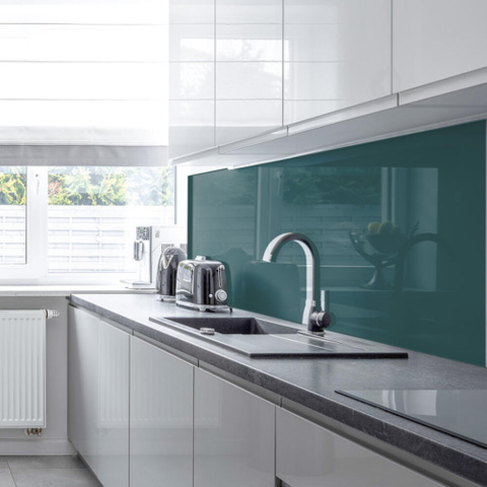
Colour Choice Helps Anchor the Design Theme
Many kitchens follow a similar formula: neutral cabinets, practical worktops, and clean lines. While that approach is timeless, it can sometimes leave a space feeling a little restrained.
A coloured glass splashback livens that up instantly.
Because the glass surface is completely smooth and reflective, colour behaves differently than it does on paint or tiles. It appears richer, deeper, almost luminous under kitchen lighting. Even a simple colour can become a focal point.
“Just the classy finishing touch to my kitchen upgrade.”
This is something we hear often from customers once their splashback is installed. The right colour doesn’t simply fill a gap behind the hob, it helps complete the room.
Jade Green – A Softer Take on Green
We’ve had a Lime Green shade for many years, which is a nice vibrant green colour with a lot of “pop”, but might be a bit much for some tastes. Jade Green sits somewhere between muted and vibrant. It has the quiet freshness of natural stone, but with a clarity that glass enhances beautifully.
In a kitchen filled with light woods or pale cabinetry, Jade Green adds a sense of calm balance. It doesn’t shout for attention, but it absolutely rewards a second look.
Designers often describe greens like this as “grounding colours” — tones that make a room feel settled and relaxed. It’s an excellent choice if you want colour, but without overwhelming the space.
Pair it with brushed brass handles or natural timber worktops and the effect feels effortlessly contemporary.
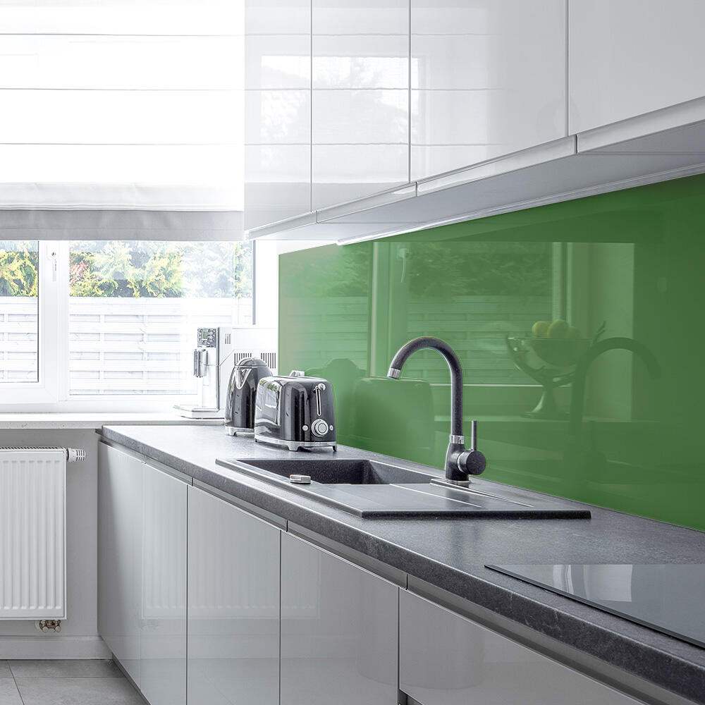
Emerald Green – Depth and Drama
Where Jade Green is gentle, Emerald Green goes for a darker, richer hue.
Deep greens have made a remarkable comeback in interior design over the past few years. They bring a sense of luxury that few colours can replicate, especially when used on glossy glass surfaces.
Against white cabinetry, Emerald Green creates contrast. Against darker kitchens, it becomes almost jewel-like. And once installed, it tends to attract attention.
“Love my amazing splashback. I get loads of lovely comments from family and friends.”
That reaction is exactly what bold colours are meant to create.
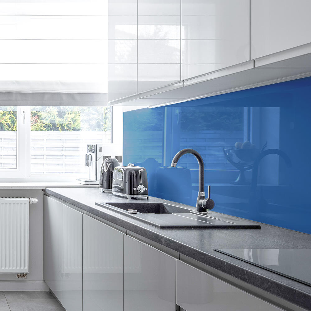
Capri Blue – Bright, Fresh and Energetic
Then there is Capri Blue, perhaps the most playful of the new additions. We haven’t really had a blue colour in the Premier Colour range before, so this fills a gap customers have been looking for.
If Jade is calm and Emerald is luxurious, Capri Blue is pure brightness. It recalls clear coastal water and summer skies — the sort of colour that instantly lifts a room.
Used behind a hob or along a worktop run, it introduces a lively note without becoming overwhelming. It works particularly well in modern kitchens where white units, grey worktops and stainless steel appliances dominate.
The splash of blue breaks the monotony and introduces a sense of movement and light.
Three New Colours, Many Possibilities
What makes the Premier Colour range particularly appealing is that these shades are not limited to splashbacks alone.
The same colour can be carried through to our other products, including:
- Radiator covers
- Glass placemats
- Chopping boards and Hob Covers
- Glass Wall Clocks
- Coasters
The result is a space where the design feels intentional rather than accidental.
Instead of one isolated colour feature, the room gains a subtle thread running through multiple surfaces.
A Growing Palette
Interior tastes change, and homes evolve with them. We’re glad to expand the Premier Colour range, and bring more options to your table.
Some customers want soft, understated tones. Others prefer colours that make a clear statement. By adding Jade Green, Emerald Green and Capri Blue, the palette widens to give homeowners a few more creative options.